A small-batch bakery
Brownies, custom celebration cakes and other baked goods need both appetite appeal and practical order details.
Akilan’s Bakery / Website study
A website for Akilan’s Bakery & Confectionery in Salem, organised around its products and the WhatsApp conversations through which customers place an order.
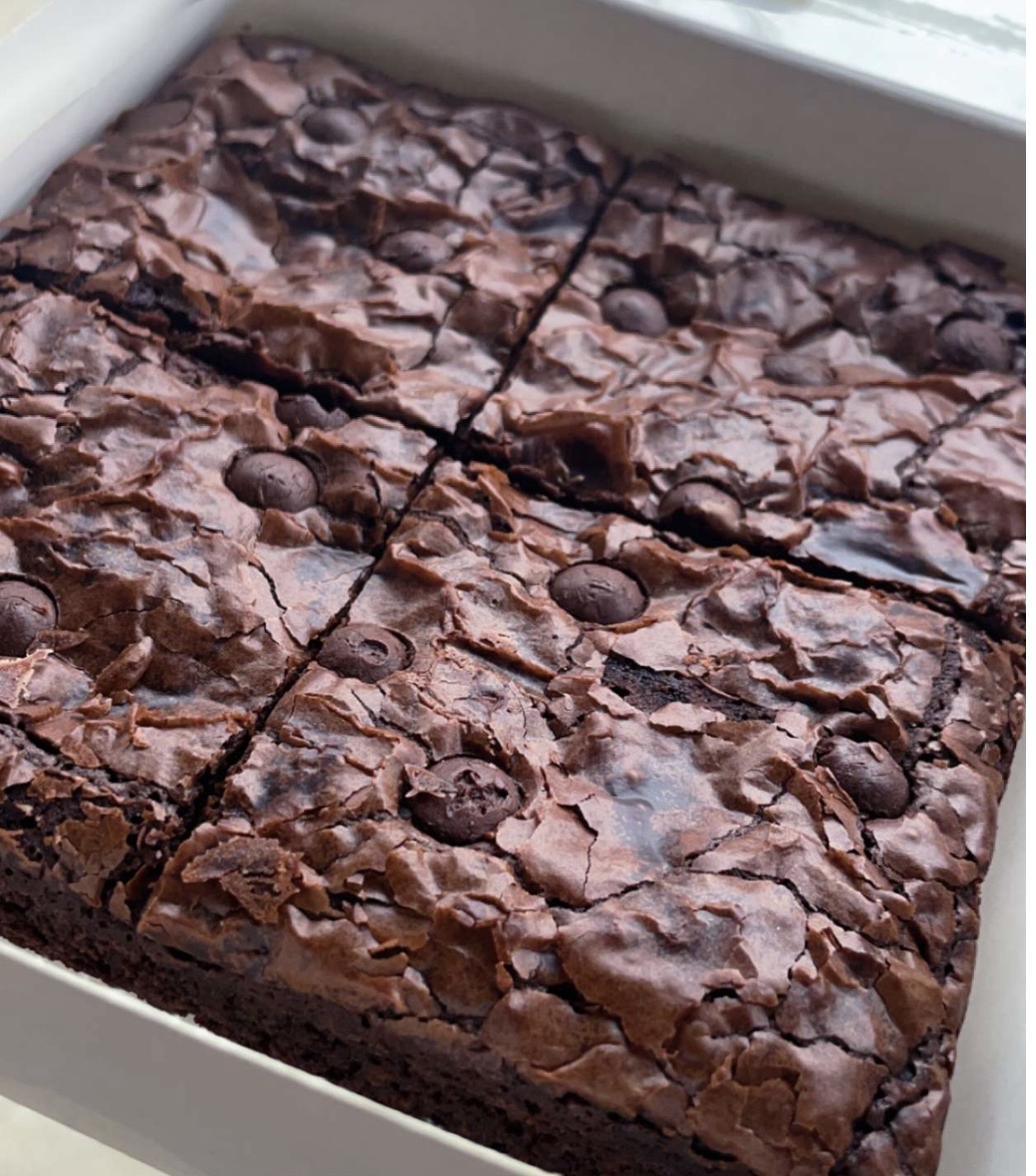
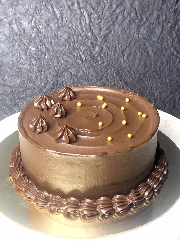
Brownies, custom celebration cakes and other baked goods need both appetite appeal and practical order details.
The website prepares a WhatsApp conversation rather than introducing a separate checkout.
The build contains product sections, a menu, gallery and contextual order prompts.
01 / Make the journey useful
A custom cake is a conversation about flavour, size and the occasion. Sending every visitor into the same blank chat would discard what they had just been looking at.
The build uses context-specific WhatsApp messages. A brownie enquiry starts with brownies; a custom-cake enquiry prompts for flavour, size and date. The design aim is to carry useful context from the page into the conversation. It is a design rationale, not a measured reduction in ordering effort.
Introduce the brownies.
Show formats and prices.
Use the cake gallery.
Carry the context into WhatsApp.
Try the ordering handoff
This demonstration builds the enquiry from the product someone was browsing. It does not contact the bakery.
An interactive illustration of the website’s contextual message design. No order is placed.
02 / Give products the attention
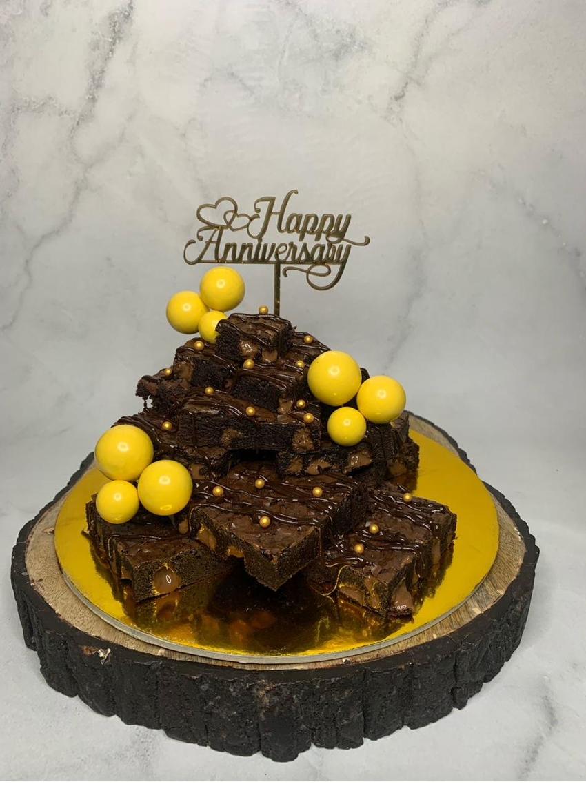
The visual direction pairs deep navy, gold and cream with generous product photography. The signature brownie establishes the first impression; the gallery then shows the range of celebration work.
On smaller screens, the navigation reduces to the brand and ordering action. A persistent order entry and contextual section links give visitors more than one point at which to begin the conversation.
03 / Build for the business
The implementation is a responsive static page with embedded photography and no application backend. That keeps the handoff straightforward for a small business that primarily needs to be found and contacted.
The local build is the evidence available here. Business contact details, prices and testimonial claims still need final owner verification before a public business launch. I do not claim order growth or conversion results.
What the work achieved
The project demonstrates content hierarchy, responsive craft and a context-aware ordering handoff using the business’s existing channel.
Website design and AI-assisted implementation: Sivabalan M. Product photography from the supplied project. This is a website build study, not a report of measured business outcomes.
Next project
Have something in mind?