The headline reward is not the whole answer
Fees, caps, payment channels and acceptance can change which card is useful for a purchase.
Varambu / Independent product
Varambu is a personal finance product that helps answer which card to use, while keeping spending, upcoming obligations and the reasoning behind the recommendation understandable.
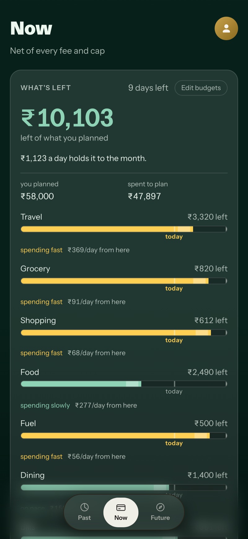
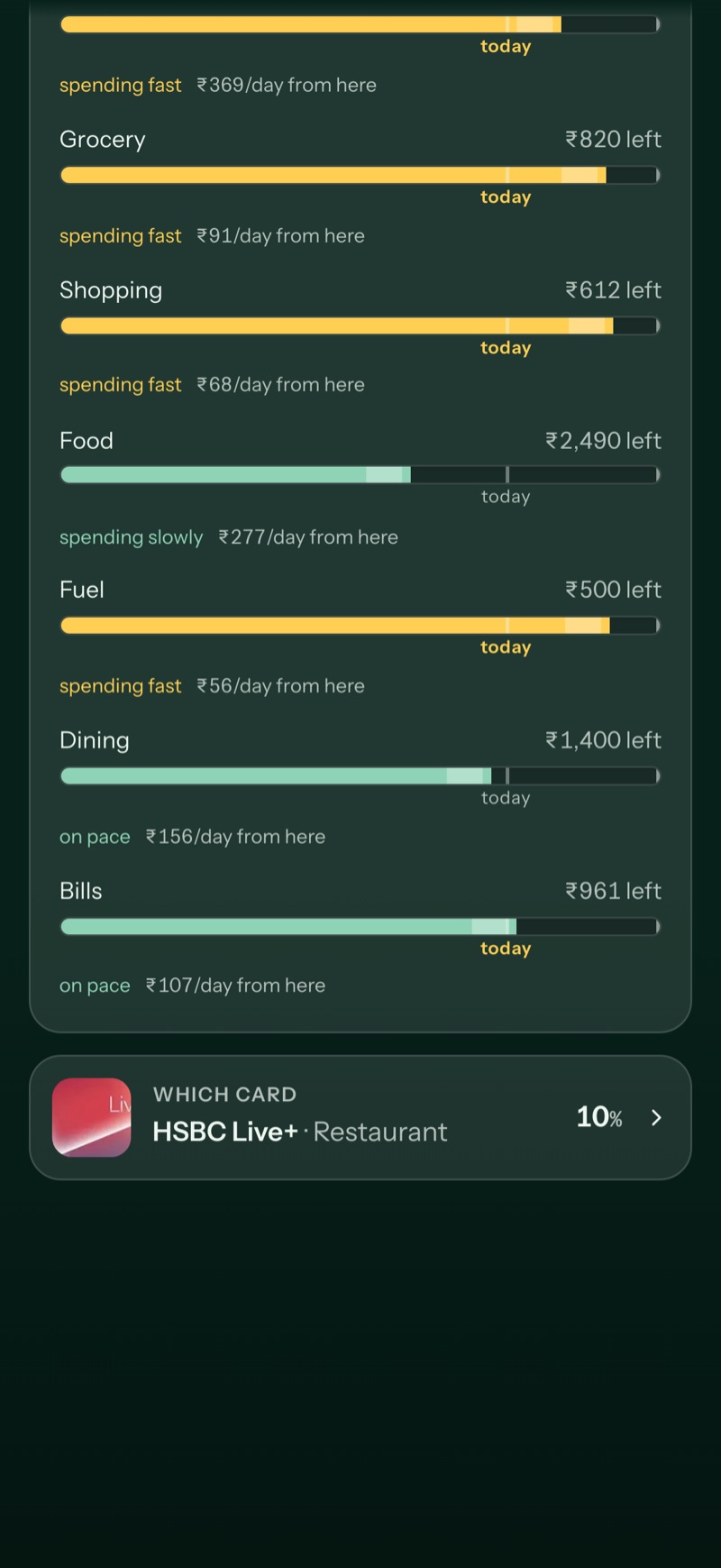
Fees, caps, payment channels and acceptance can change which card is useful for a purchase.
A recommendation needs both a clear answer and a defensible model behind it.
The case rests on the implementation and its decision rules, rather than adoption claims.
01 / An old question
In April 2020, my coursework project Spenders explored credit-card spending and saving through a 20-question survey with 151 responses, an affinity map, four personas and a journey map.
One persona focused on comparing offers and paying in full. Its journey map identified an opportunity to help choose the best card for a purchase. Varambu returned to that question in 2026 with a working product.
The sample was concentrated among young IT professionals in Tamil Nadu, with many respondents owning no card at all. It is useful as the project’s origin, not evidence of how everyone pays today.
The journey map named the difficulty of choosing a card while remembering offers and bill dates.
The product should resolve the purchase decision instead of requiring the user to calculate it.
02 / Define the answer
A reward rate can look attractive while producing a poor outcome after fees or an exhausted cap. The same card can behave differently online, in store or through a particular payment channel.
I treated these rules as part of the experience. The recommendation needs to account for net value and actual eligibility, and the product needs to explain uncertainty when information is stale.
Is this card usable for this channel?
Is the reward still available?
What value remains?
Give an answer with its conditions.
Use spending pace to explain whether a plan is holding. Available budget should not become encouragement to spend it.
Reserve the strongest warning treatment for money lost. Ordinary status should be readable without demanding attention.
An estimate or old sync should be labelled. A precise-looking number should not disguise uncertain data.
The app helps interpret and decide. It does not move money. Raw statement bodies are outside the intended stored record.
03 / Organise the experience
Separating these time horizons keeps the app from becoming one large financial report. Past supports understanding. Now supports today’s decisions. Future supports preparation. Card rules provide the explanation behind a recommendation.
I used a restrained visual system because money already carries emotional weight. Green represents positive value; amber highlights money at risk; red is reserved for money lost. The interaction should not require interpreting decorative colour.
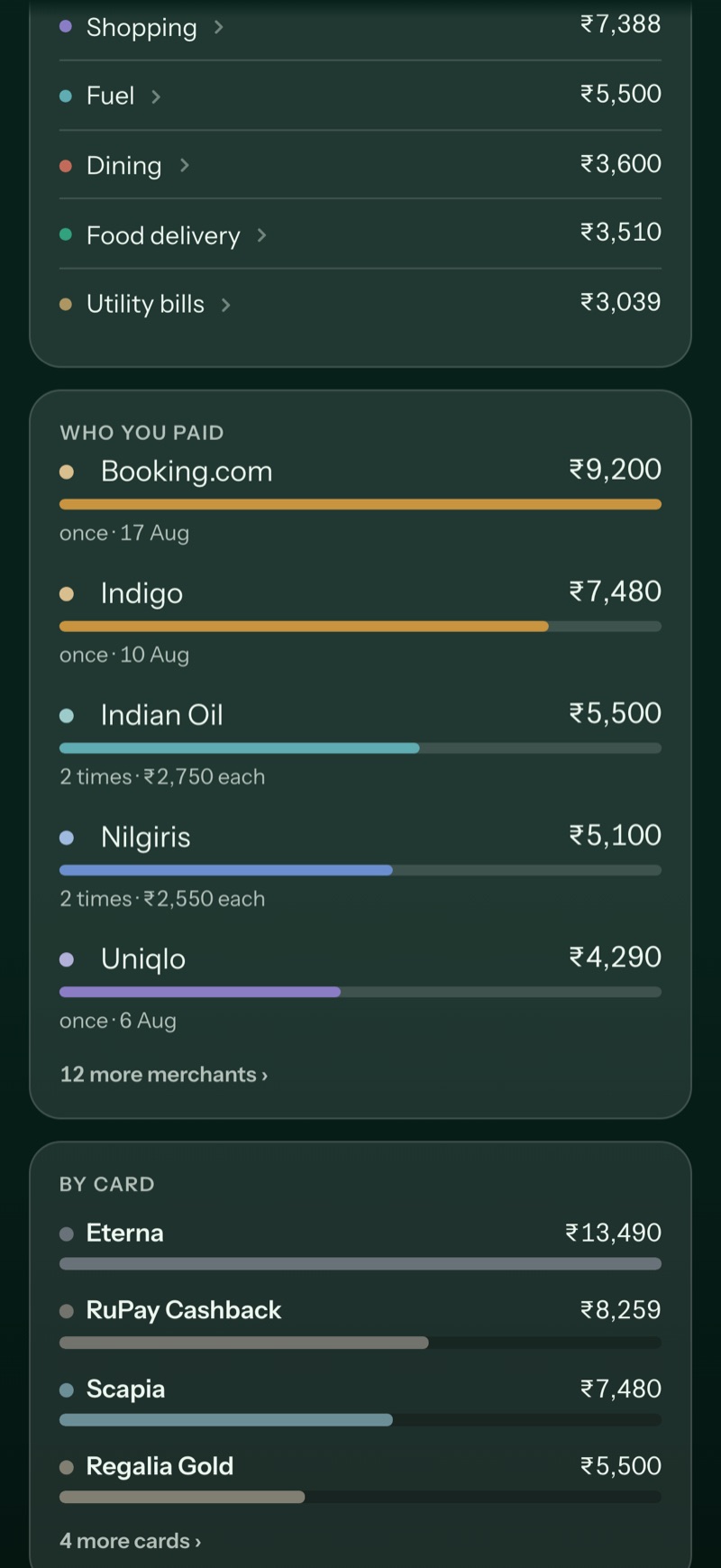
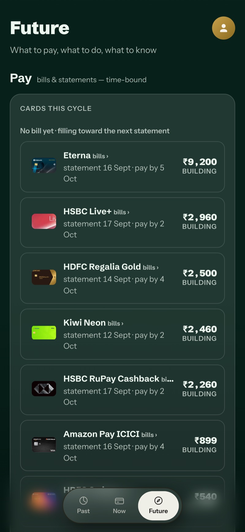
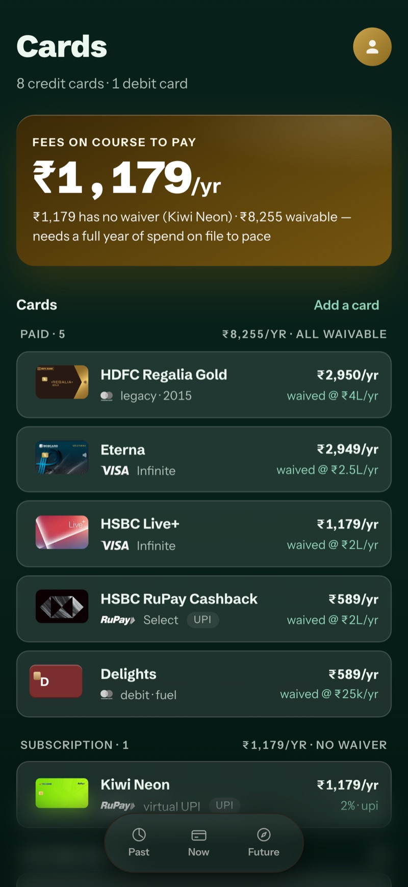
Repeated numbers need consistent alignment and spacing. Chart density should reduce before the labels become too small.
Light and dark treatments keep the same information hierarchy, while accounting for the different contrast relationships.
04 / A correction that mattered
During the v0.14.3 work, a category trend sheet revealed a deeper trust problem. Its header and rows used the full transaction charge, while the chart used the person’s share of a split bill. Both calculations could be valid, but together they answered different questions.
A ₹4,000 group lunch with a ₹1,000 personal share makes the distinction clear. Personal spending should use the share. Reward and cap calculations can correctly require the full charge. One global replacement would have fixed one screen and broken another rule.
Relevant to the charge record and applicable reward or cap rules.
Relevant to the personal spending total and category chart.
The correction led to an audit of places where existing calculation rules were bypassed by the interface. That audit also recorded intentional differences, so future fixes would not erase them. This was product design continuing after the screen had been built.
Explore the split-bill decision
Change this illustrative example to see why the same number should not feed every screen.
Relevant to the charge record and applicable reward or cap rules.
A portfolio explanation of the documented correction. This is an equal-split example, separate from the live product.
05 / What is established
The documented build includes product principles, an information architecture, implemented screens and a versioned release history. The project record reports 493 ranking-engine tests at that stage; those check recommendation logic, not customer satisfaction or business impact.
This is an independently built personal product. I do not have an adoption study or measured financial improvement to claim.
What the work achieved
The strongest outcome is the continuity between the original problem, the product rules and the corrective work after implementation. The next research step is to observe people making real purchase decisions with the recommendation.
Product design and build: Sivabalan M, using AI-assisted development. Spenders coursework research, 2020. Varambu implementation and release evidence, 2026. Screens use the project’s fictional capture dataset.
Next project
Have something in mind?