The whole team, not just the trekkers
A colleague may care more about restrooms, food or fitness than the destination.
Exoticamp / Client website
A team-outing website for Exoticamp, designed to make a nature trip feel approachable to a mixed-age group, including the colleagues who do not consider themselves outdoorsy.
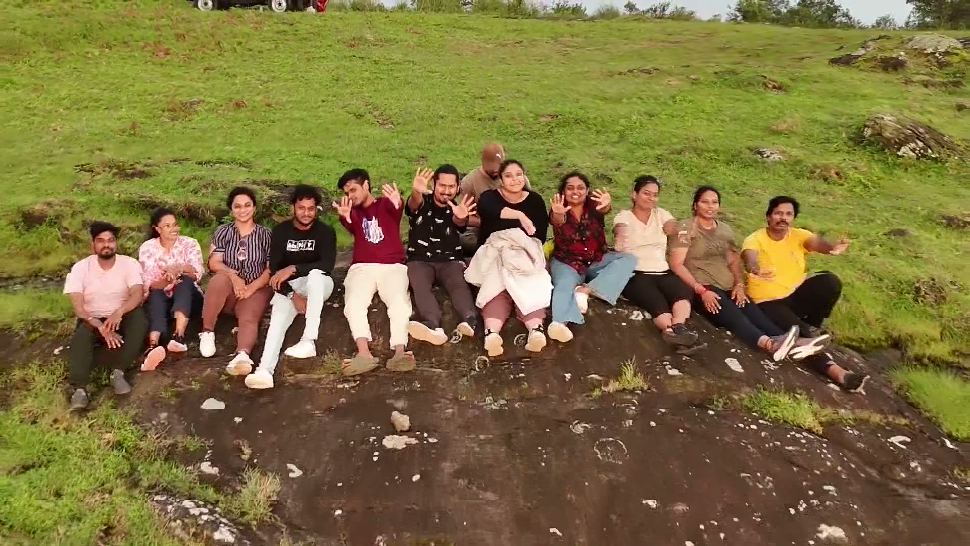
A colleague may care more about restrooms, food or fitness than the destination.
The first impression needed to answer suitability before leaning on brand credentials.
Four review passes refined content, hierarchy and accessibility. Conversion results are not available.
01 / Understand the hesitation
The brief was a single-page site for nature-based corporate outings, intended to reach employees through a forum link. A team lead might share it; a hesitant colleague might see only the preview and the first screen.
The audience spanned different ages and fitness levels. I treated comfort questions as primary content: whether the outing is beginner-friendly, how food and facilities work, and whether the whole team can participate. This framing came from the brief and review process, rather than a separate user-interview study.
Will I be comfortable, and does this suit my fitness level?
Can I recommend this with enough practical information to answer the group’s questions?
02 / Change the first impression
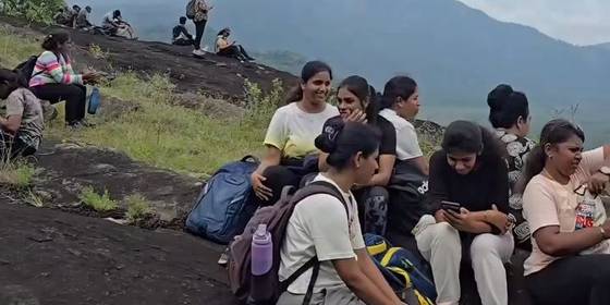
The earlier emphasis on TV and funding recognition answered whether the vendor was legitimate. Readers first needed to know whether the outing was for them. I moved reassurance higher and used actual team imagery to establish the experience.
The hero’s next step led into the introductory film, keeping the visitor with the story before asking them to choose a format.
TV and funding evidence led the introduction.
Team imagery and practical reassurance led the reader into the outing.
03 / Check the content
The source material mixed recognition, funding and credibility. I separated those ideas so that a television-panel appearance would not imply an investment. Conflicting statistics were not combined into a more flattering total.
This influenced layout as well as copy. Credibility belongs alongside the reader’s questions, with enough room to understand what the evidence actually says.
04 / Work at reading size
The review included typography, imagery, keyboard focus, motion and icons. In a set of 35 icons, six read incorrectly at their intended 30px size. A beach-camping icon, for example, looked more like a hazard warning.
I increased text sizes, removed italic body copy, added visible focus treatments and respected reduced-motion preferences. Text over photography was evaluated against difficult bright areas, rather than an average image colour.
Inspect icons at the size people will actually see. A correct vector path does not guarantee a recognisable symbol.
Give older readers readable type and clear contrast without requiring them to decode decorative text.
Make interactive controls visibly focusable and keep video controls reachable.
Allow readers who prefer less motion to receive the same information without scroll animation.
05 / Close the loop
The completed site was handed to the client after four review passes. The record does not establish a client launch or measured conversion change.
This project shows how I approach a different audience: use the brief to identify hesitation, check what the content can promise, and make the resulting page easier to read and act on.
What the work achieved
The delivered website brings practical reassurance, real group imagery, outing formats and the introductory story into a coherent sequence.
Website design and handoff: Sivabalan M, using AI-assisted implementation. Photography supplied with the client project. Delivered August 2026; business results are not claimed.
Next project
Have something in mind?